

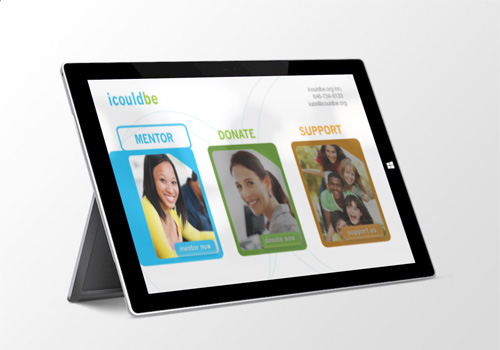
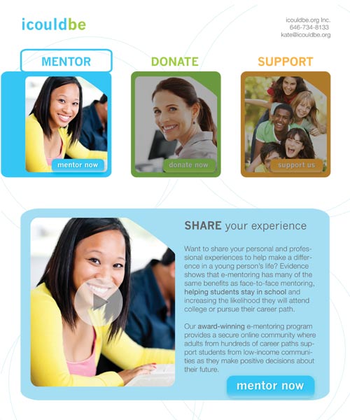
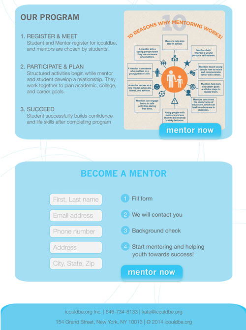
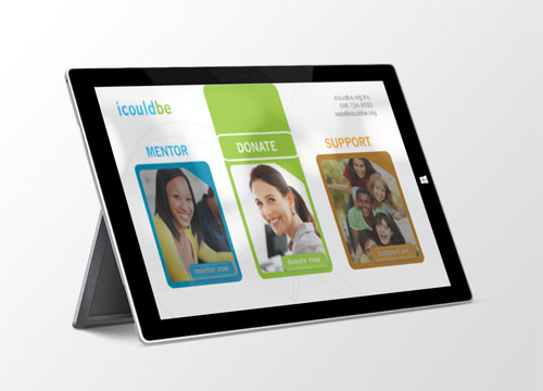
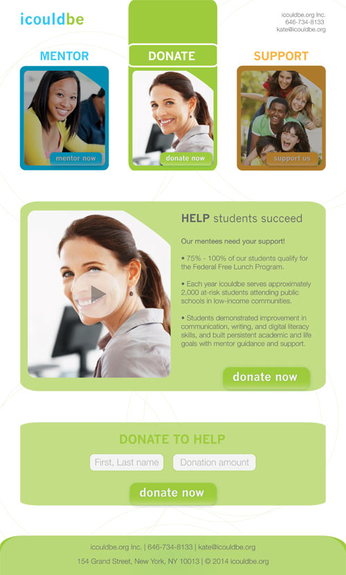
OBJECTIVE To redesign a website for nonprofit online mentor program, icouldbe.org. Interface should be responsive and resize to varying screen devices (desktop, tablet, mobile). The site should generate viewer interest and make it simple to become a mentor or sponsor.
STRATEGY The website has been simplified into 3 main pages, each with a one-column layout. Each page will contain the information in a defined section that can be scrolled to. This simplified layout encourages more call-to-actions and will make it easier for visitors to become a mentor, donate, or support icouldbe. The brighter color palette energizes the viewer and reflects the energy imbued by the mentor/mentee relationships. Call-to-action and social media buttons are prominent and appear in every section.
VIEW SITE BEFORE REDESIGN